How to take photos for your online dating profile - activity photo

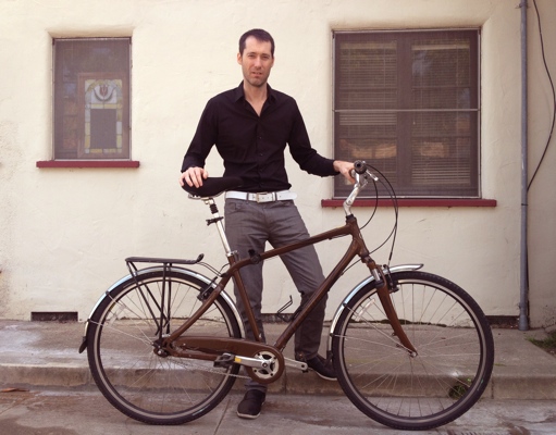
This photo is inclusive. The viewer can imagine coming by my apartment after our date and checking out my bicycle.
But imagine if I had chosen to pose on top of the bicycle. That would have taken the viewer out of the scene . There would have been no role for the viewer. This is a subtle but important difference.
Think about an activity you and the other person could do together and then design a photo around it in such a way that the viewer is included. Don’t just snap a photo of you camping but rather snap one of you needing help setting up a tent. Don’t just take a photo of you cooking but rather a photo of your in your apron welcoming the camera to your kitchen.
I can’t over-stress how helpful you will find it to reduce the number and complexity of your photographic elements. Here we only have a bicycle, a wall, two windows and me. Free from distraction the viewer can more easily appreciate color, framing and the subject.
The photo is also monochromatic. The only color is the red on the widows that is somewhat echoed in my skin tone.
The wall makes an effective backdrop. Erika and I used this as the backdrop for a video we made recently if you recall. Walls are your friends.
By the way, this is the only photo I didn’t snap myself. Erika took it with my iPhone. I think she has a great compositional eye.
I like that the lines are not quite horizontal and perpendicular. They have a bit of angle to them across the photo. That’s good.
Also notice that the pipe on the wall and the ledge my trailing foot hangs over give the photo a framing effect. We’ve created a feeling of containment which is helpful to make the viewer feel comfortable imagining themselves being part of the scene. Try it. I bet you can imagine just walking out of the camera and taking my bike for a ride.
One criticism is that this picture would be better if I was smiling. That’s what you’d do on a date when showing your bicycle to someone.
