How to take photos for your online dating profile

By Wayne Elise
Many of the people for whom I’ve written dating profiles have asked my advice on photos. I thought I’d create a small guide for them and for you.
Feel free to forward this to your friends out there who might have no idea how to create the photos they need to make their dating profile work.
Your photos are the most important element to your success in online dating. No matter how great your text or text that you hire someone like me to write for you, the people who check out your profile are going to look at your photos first before deciding to get to know more about you.
How many photos
If you happen to have one primary photo that kicks ass and solicits a lot of responses then go with that one photo and you should be fine. But depending on the service you use, people cruising online dating sites these days often expect to see more photos before they invest time reading your profile. The experience is becoming more like Facebook. So understanding the process of creating several photos that harmonize is helpful.
Take Photos for this specific purpose
Don’t repurpose random photos you’ve shot in the past for your profile. Instead snap new ones. You’ll be able to control and create a clear message with each photo that integrates with your ‘About Me’ text. Also you want the people looking at your photos to feel you cared enough about the process to create something that has unity and harmony.
Wearing the same clothing, using the same light, shooting in similar locations and limiting the other people in the photos will give the viewer the feeling of hanging with you on a date.
I recommend wearing a single outfit - preferably something monochrome and adding an occasional accessory for color. In my example photos I’ve used a scarf and sunglasses to add color and variety.
DIY
It may feel tempting but don’t hire a professional photographer. I’m sure you’ve seen photos from people who do that. You can always tell. Using professional photos will tell people you have no idea how to communicate your message yourself in a clear and engaging way. It says you lack creativity and imagination.
Taking your own photos is easy. I shot all the example photos myself on my iPhone in just an hour walking around my neighborhood.
Converse with and include the viewer
You tell people as much about yourself by the way you shoot a photo and present a collection of photos as you do with the subject of the photos. You want the process to reveal you to be fun and thoughtful in your communication with other people.
The way I look at dating profile photos is similar to the way I teach conversation skills. Presenting a photo is like having a conversation with your viewer. It’s not just what you say that matters but also how you say it.
You want to leave room in your photo for the viewer to imagine themselves in the scene with you. More on that later.
The elements of a photo
Subject - This will be you.
Color - Emphasize one or two colors and minimize the rest using monochrome background and clothing.
Composition - This is the arrangement of visual elements. Be creative. Shoot from different angles and heights.
Background - Keep this simple. Monochrome walls are your friends.
Light - Only pro photographers with expensive lights should shoot indoors. Shoot outdoors in the morning or before sunset when the shadows are soft.
Good photography is about controlling and harmonizing these five elements. The easiest way for us amateur photographers to tame these is to simplify them.
Tools

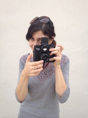
Despite the picture at the top of this article of Erika aiming her Holga camera - she loves that thing, I’ve taken the example photos myself with my iPhone camera by either holding the phone out with my arm or using a 99 cent photo timing app on my phone. I cropped and adjusted brightness/contrast using iPhoto on my MacBook.
Avoid other people: Generally speaking, unless you have a specific ‘creative’ reason, don’t take pictures with other people either next to you or in the background. Using other people in the frame can send confusing and conflicting messages to the viewer and can prevent the viewer from imagining themselves in the scene with you. Adding people also adds another element that’s hard to control.
The Mission
To show you how easy getting good photos can be I snapped all the example photos by walking around my neighborhood here in the morning for an hour. From start to finish, including editing, the process took less than two hours. The end result is not perfect photos by far. But they have a unity of theme and reveal my personality in both the subject and the effort and creativity it took to create them.
Think of the ideas as starting points for your own creativity. It’s cool to experiment. You DO get points for that.
